Design Tips
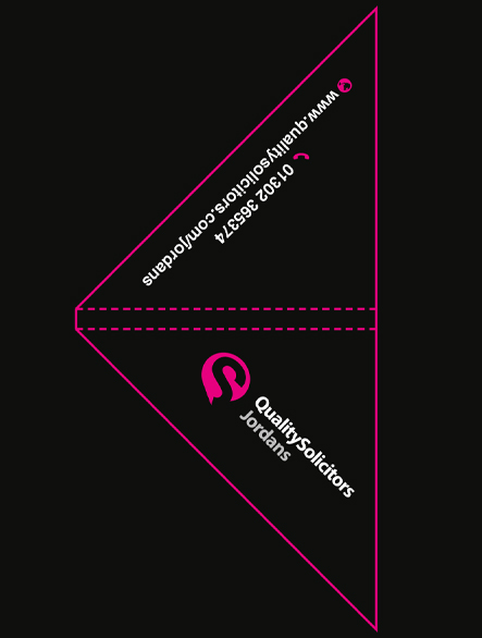
Designing your own legal corners from scratch can be unnerving – there’s a lot to consider! Take a look at our previous design gallery for some ideas and inspirations and our Artwork Guide for the technical side! Below, we’ve compiled our top 5 tips for ensuring print-perfect, eye-catching artwork!
Branding
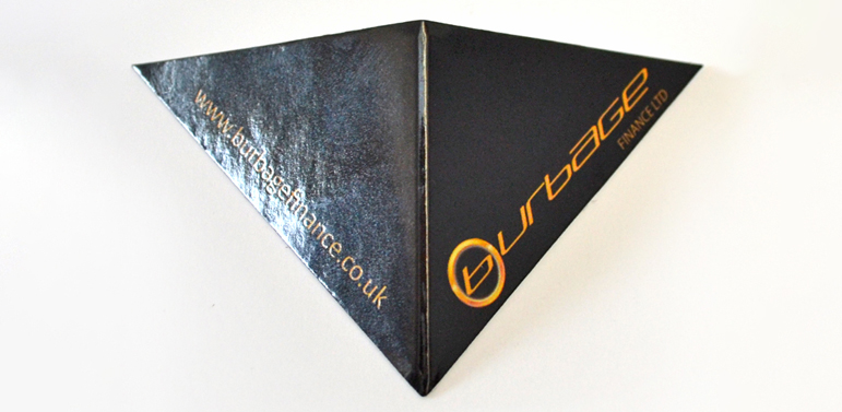
The most important aspect of your legal corner- you want customers, clients, patrons, students – whoever is looking at your documentation- to immediately know and recognise your company. Ensure you display your logo prominently, and try to include some contact details – your website, phone number or social feeds.
Colour
Use colour judiciously- too many colours on such a small item can make your document corners look messy! Keep it simple and clean and use colours that compliment and reinforce your company branding.
Shape
Choose your shape with care. Are you trying to convey an established, traditional company? Then the standard triangle is for you! But perhaps you’re trying to convey your innovation and vitality- consider using a custom-shape. With our die cutters, we can create any custom shape at all, giving you a whole world of possibility to think outside the (triangular) box.


Special Touches
Are you conveying luxury, exclusivity or quality? Then consider adding some special finishing touches to your legal corner designs. Foiling, Spot UV or gloss lamination all add a sense of ‘wow factor’ and will communicate your top-quality brand to your audience.
Space
On such small items, blank space is a crucial element of design. If you overcrowd it can look messy and unprofessional. Keep it simple, spaced out and elegant for a truly eye-catching and communicative design.
Should you prefer to leave it to the professionals, take a look at our Design Services.
Need help with preparing your design?
Get in touch for expert advice and support today